The Challenge
The initial brief came from the product team: “Enable users to ask questions about their workspace in plain language.” That was it! No specific success metrics, or guiding principles beyond “be helpful.”
Plane is a modern project management tool built to help teams plan and execute work effectively. As teams grew, one major gap became clear: users, especially admins and project owners, didn't have an easy way to understand what was happening across their workspace at a glance.
TIMELINE
Jul - Aug 2025
TEAM
Shivangi Jain 1 PM and 3 Developers
MY ROLE
I conducted user research, developed end-to-end solution & prototype, and participated in QA testing up until the go-live date.
Plane is a project management tool scaling for startups to enterprise level. It's a B2B SaaS product, directly competes with tools like Jira (Atlassian), Linear, Monday etc. It aims to simplify managing and assigning workflows internally in an org and also maintaining visibility with clients.
The initial brief came from the product team: “Enable users to ask questions about their workspace in plain language.” That was it! No specific success metrics, or guiding principles beyond “be helpful.”
I reviewed support tickets and feature requests, talked to a few active users, and spent time in our own Plane workspace watching how the team used grouping day-to-day. Major requests people kept getting into:
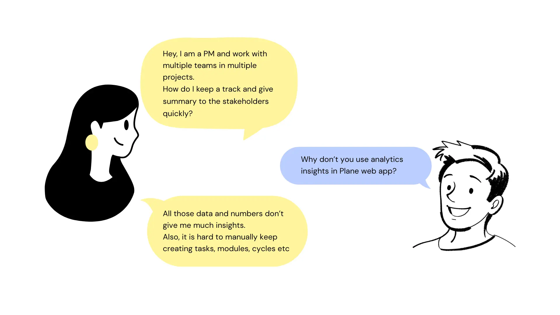
Analytics isn't much helpful, the graphs are fine, but we need something quick to discuss over.
Organizing and handling multiple teams and projects is a task, and my work has low visibility.
Pages is a nice feature, but I rely heavily on external AI tools to write PRDs, without that it's a waste.
Multiple managers work on same board and create repetitive tasks, at times assigned to different ICs.
Is the product reliable? I don't want my team to invest their efforts in the tool than the work itself.
Existing tools already have the AI support that helps me summarize and analyze projects better.
Key design questions I defined early on:


Users weren't just asking for more grouping options instead they were struggling with context switching and information overload.

The tool was flexible, but it forced them to constantly reconfigure their view to get the information they needed. These questions helped pivot the brief from “add chat” to “augment insight discovery and reduce friction.”
Major products in the market were for coders, designers, generalists etc. But project management tool having AI as chat, canvas and agent was still evolving.


We initially built a basic chat overlay where users could type questions and see responses. Early prototypes focused on handling simple queries like “show recent bugs” or “what tasks are overdue.”

Next iteration integrated context awareness:

We emphasized task outcomes in the conversational UI, e.g., “show me all high-priority issues blocking this cycle” turned into a structured list with links back into the workspace. At this stage, user feedback highlighted another tension: clarity vs. verbosity. We iterated on response design patterns; concise bullets with optional expanded explanations.

Concept 1: Alerts user for potential duplicate tasks, reduced 38% of repetitive tasks.

Concept 2: Aimed for structural and cleaner UI, to incorporate complex actions.
Free-form natural language is inherently ambiguous. “Show overdue tasks” could mean different things depending on filters, projects, or views.
SOLUTION:
We designed disambiguation prompts and offered filter suggestions to refine queries. If the AI wasn't confident, it asked clarifying questions before answering.
There was a high chance of responses feeling helpful but being technically imprecise.
SOLUTION:
We invested in previewing reasoning behind results, surfacing the logic, so users could understand why a certain set of tasks matched their query. This transparency built trust and helped users refine their questions.
Originally, the read-only design (no automatic write capabilities) limited the assistant's usefulness.
SOLUTION:
We focused instead on insight amplification. By steering users toward more actionable queries and linking results back to the core Plane UI, users still felt productive without the AI performing automated actions (which came later in the roadmap).
Plane AI launched as a conversational assistant capable of:
Though quantitative metrics are internal, qualitatively users reported less frustration with navigating complex workspaces and a noticeable reduction in time spent on analysis tasks. More importantly, the design set expectations for future iterations, including action execution and iterative refinement of conversational flows.
Let's connect to discuss more about the AI agents, workflows and what the final designs looked like.


