Rethinking How Teams Understand Their Work
Nov - Dec 2025
Plane is a modern project management tool built to help teams plan and execute work effectively. As teams grew, one major gap became clear: users—especially admins and project owners—didn't have an easy way to understand what was happening across their workspace at a glance.
Industry
B2B, SaaS Product
What did I do?
Lead Designer & Product Thinker, owning the end-to-end experience.
Problems
You are an admin who wants to see a months overview, work logs and timeline.
You go to Workspace >> Analytics....
👀notices → different kinds of METRICS, information scattered and no insights
Questions:
- - What is the progress of ongoing initiative?
- - What are th blockers or bottlenecks?
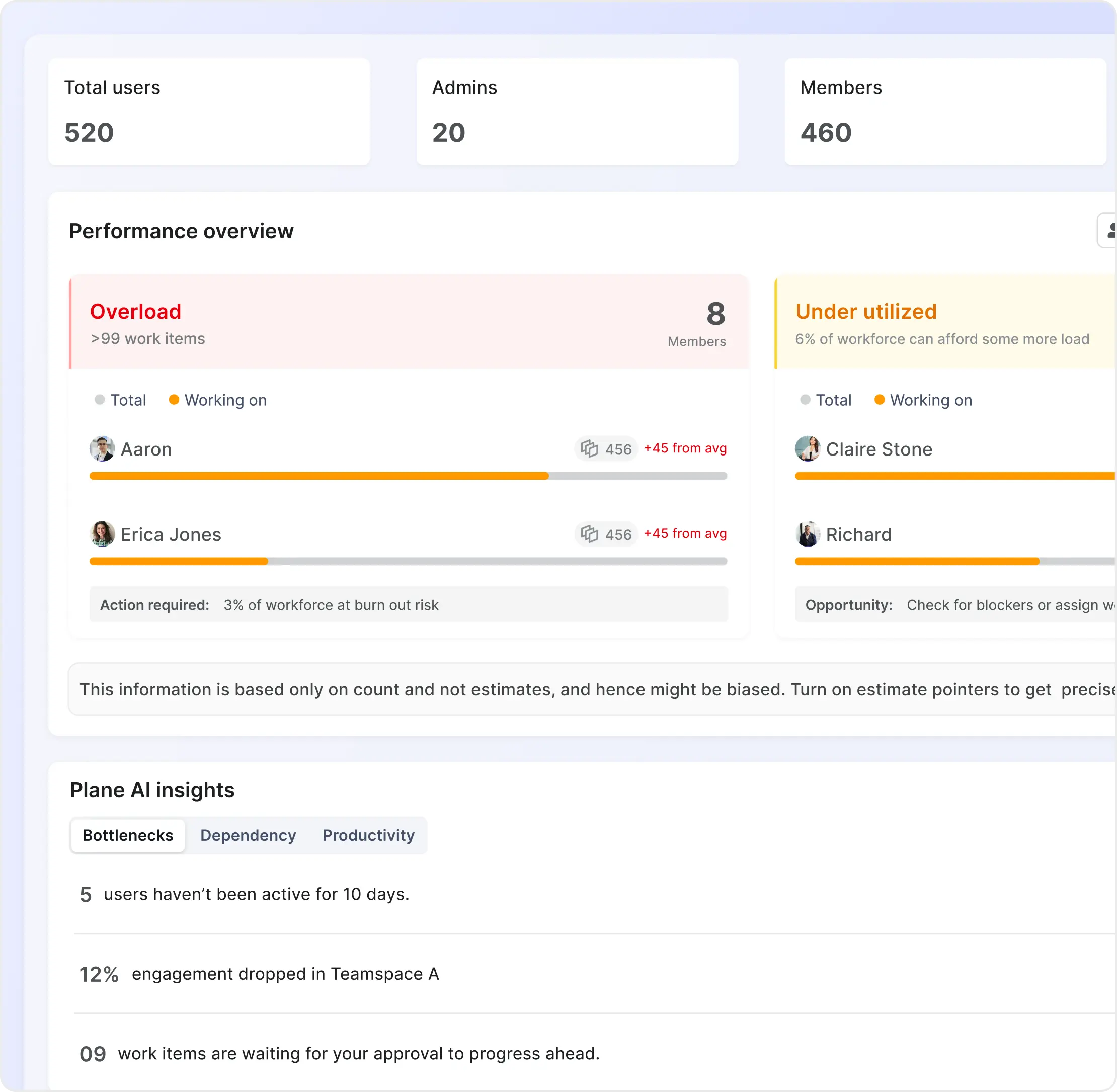
- - What is the total workload on workspace members?
- - Who all are over loaded and who are underutilized?
- - What are the project vs teamspace contributions?
- - How do I make changes to fix current leaks?
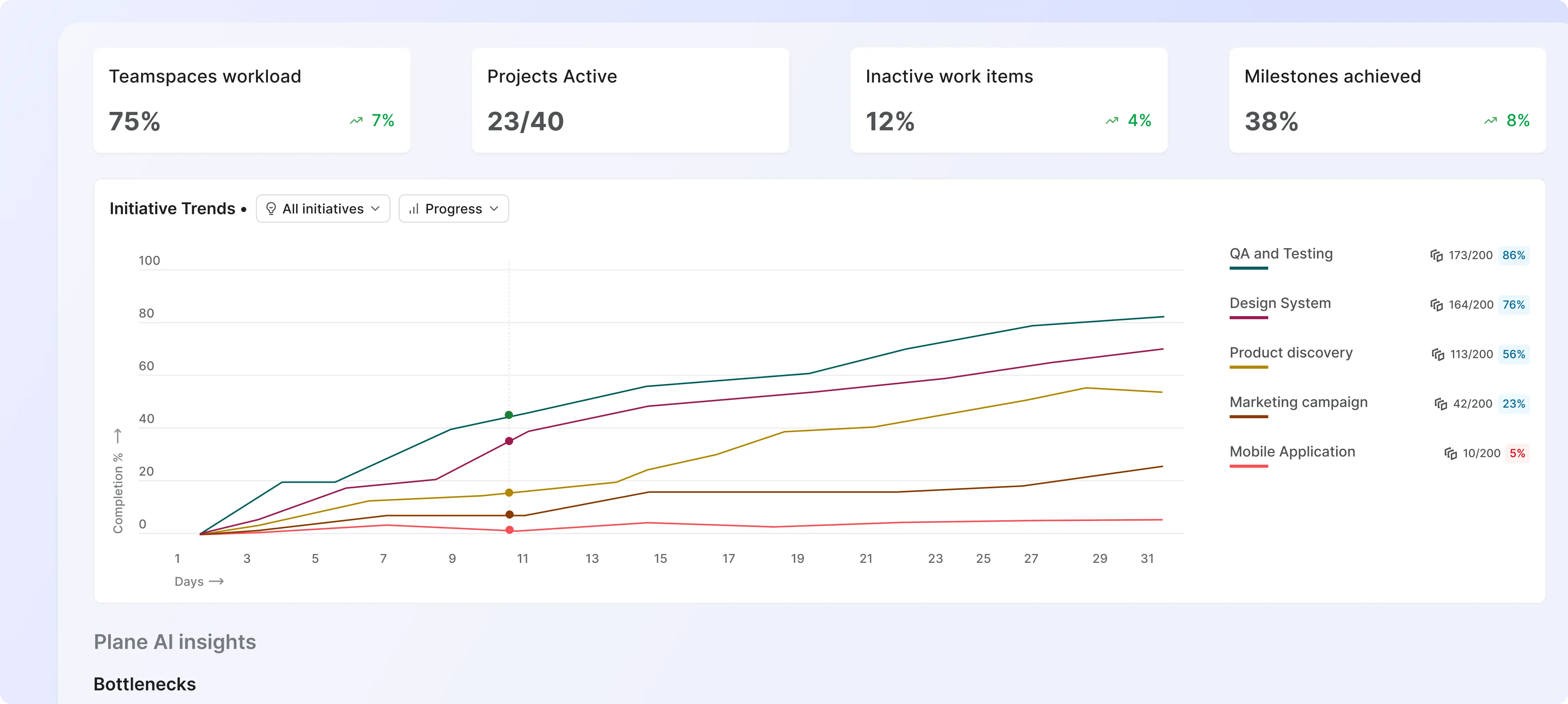
- The previous analytics experience was scattered, generic, and metric-heavy, making it hard for users to get real value from the data. Everyone saw the same dashboards, regardless of their role or context.
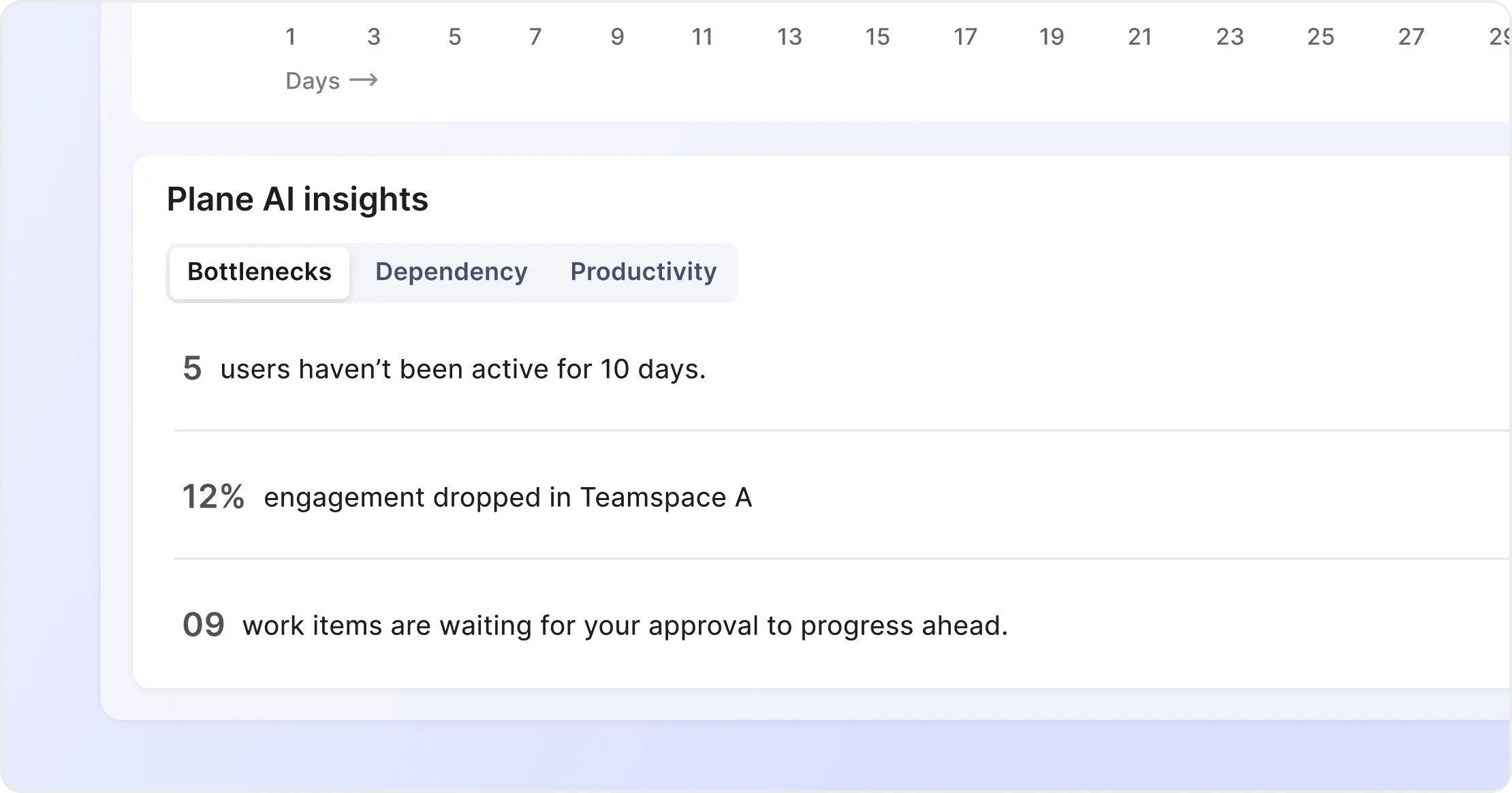
- The biggest challenge: analytics were visual but not actionable. For example, seeing “10 stagnant work items” meant nothing unless users could drill in, explore the items, and take action.
Goals
The goal of introducing Analytics was to surface meaningful insights upfront, tailor information based on user roles (Admin, Member, Guest), and create simple, actionable data visualizations.
These insights included identifying inactive areas, spotting stagnant work items, and understanding how long items take to move from intake to the roadmap.
Identifying the areas to solve for
I started by documenting issues in the existing experience and conducting a broad competitive review—looking beyond direct competitors to tools that excel in analytics design.
To expand the solution space, I also used AI (primarily ChatGPT) to explore what meaningful insights could look like—patterns around inactivity, bottlenecks, work item types, and flow times.
I then grouped insights into:
- Core entities (Projects, Cycles, Work Items, Users)
- Role-specific views (Admins vs Members vs Guests)
This structure became the foundation for a focused and scalable IA.
Brainstorming & Concept Exploration
With the problem space defined, I went wide. I sketched multiple concepts with different philosophies:
- Hybrid formats that blended tasks and timelines
- Card-first layouts for quick scanning
- Chart-first layouts for data-heavy teams
- Deep-dive insights vs lightweight summaries
This phase was intentionally messy, sticky notes, low-fi wireframes, dead-end ideas, everything.
Iterations & Solutions
After several rounds of iteration and internal feedback, the winning structure became clear—simple dashboards organized by entities, enhanced with role-based logic, and supported by interactive charts that let users drill down into real work items.